There are big changes coming to drivers in many major markets starting today, including the ability to see earnings + drop-off destination for every ride, rate rebalancing, and more. Which markets will be getting these changes? Which drivers will benefit from these changes, and which drivers will lose out? We’ll break down everything you need to know below.
Uber announced these changes in an effort to “provide greater transparency and clarity around earnings”, but there are some things drivers will and won’t like about these changes.
Quick summary:
- Upfront pricing for drivers is transitioning into more markets giving drivers consistency and reliability in earnings.
- Rate Balancing will be increasing earnings for short trips and lowering pay for longer trips overall.
- Drivers who prefer short rides may come out ahead vs. drivers who prioritize long trips
Get all the latest Uber news directly in your inbox! Sign up for the RSG newsletter here.
Updates September 2022: Upfront Pricing and Trip Radar Expands to New Cities
In September, Uber announced upfront pricing and trip radar would expand in more markets. What does this mean for drivers?
- More information on every ride, including how much you’ll make and where you’ll go
- Fares won’t be based on fixed time and distance rates alone any more
- If there’s unexpected traffic and a trip gets longer, your fare will increase
- If there’s a change of pickup or dropoff address in the app while you’re driving, your fare will be updated
Here’s which markets will see these changes in late September 2022:
- Indianapolis
- Pittsburgh
- Connecticut
- Chicago
- Grand Rapids
- Rhode Island
- Birmingham, AL
- Charleston
- Columbia
- Greenville, SC
- Las Vegas
- Reno
- Santa Barbara
- Fresno
- Inland Empire
- Los Angeles
- Orange County
- Palm Springs
- Sacramento
- San Diego
- San Francisco
Updates July 2022: Upfront Pricing Expands
In March, Uber announced big changes to driver compensation and upfront pricing (keep reading below for more information). In July 2022, Uber’s CEO announced in a live and live-streamed presentation that the program would be expanding.
The biggest news for drivers? Even more will see earnings and drop off destination information for their ride requests.
Trip Radar is also expanding, which allows drivers to see a list of other trips happening nearby. Drivers will still get individual trip requests but can also pick another trip that works better for them.
Also, Uber announced big changes coming to Uber Pro in November, including an annual cash reward. You can read the full Uber announcement here and stay tuned to RSG for Uber Pro expansion news in November.
Upfront Pricing for Drivers Moves Into New Markets
Beginning today, drivers in over 20 markets will now see earnings and drop-off destination info on their ride requests. If this is rolling out in your market, you should have received an email by now.
Some of the bigger markets where these changes are rolling out include:
- Dallas
- Houston
- Atlanta
- New Orleans
- Cincinnati
- St. Louis
- Tampa
According to Uber, this is an initial test in a total of 24 markets. It may roll out to other markets, or it may evolve and roll out in other ways. Stay tuned!
Update July 2022: As promised, Uber is rolling this program out to more areas. If your market is on this list but you haven’t seen changes to your app yet, they will be rolling out soon.
- Upstate NY
- Harrisburg
- Lehigh Valley
- Philadelphia
- Wilkes-Barre Scranton
- Madison
- Washington D.C.
- Miami
- Orlando
- Tallahassee
- Louisville
- Baltimore-Maryland
- Charlotte
- Piedmont Triad
- Tulsa
- Nashville
- El Paso
- Phoenix
- Tucson
- Denver
- Boise
- Omaha
- Albuquerque
- Salt Lake City
- Boston
- Worcester
This is very similar to what rolled out in California in 2019 called upfront pricing, with one notable exception: drivers in these markets will not have to maintain any level of acceptance rate in order to see upfront pricing. But Uber will be ‘rebalancing rates’ and lowering the per-mile rate and increasing the per minute rate to avoid having drivers cherry-pick the best rides (short rides will pay more, longer rides will pay less).
According to the email from Uber that drivers in these markets have started to receive, this is how upfront pricing for drivers will work:
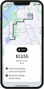
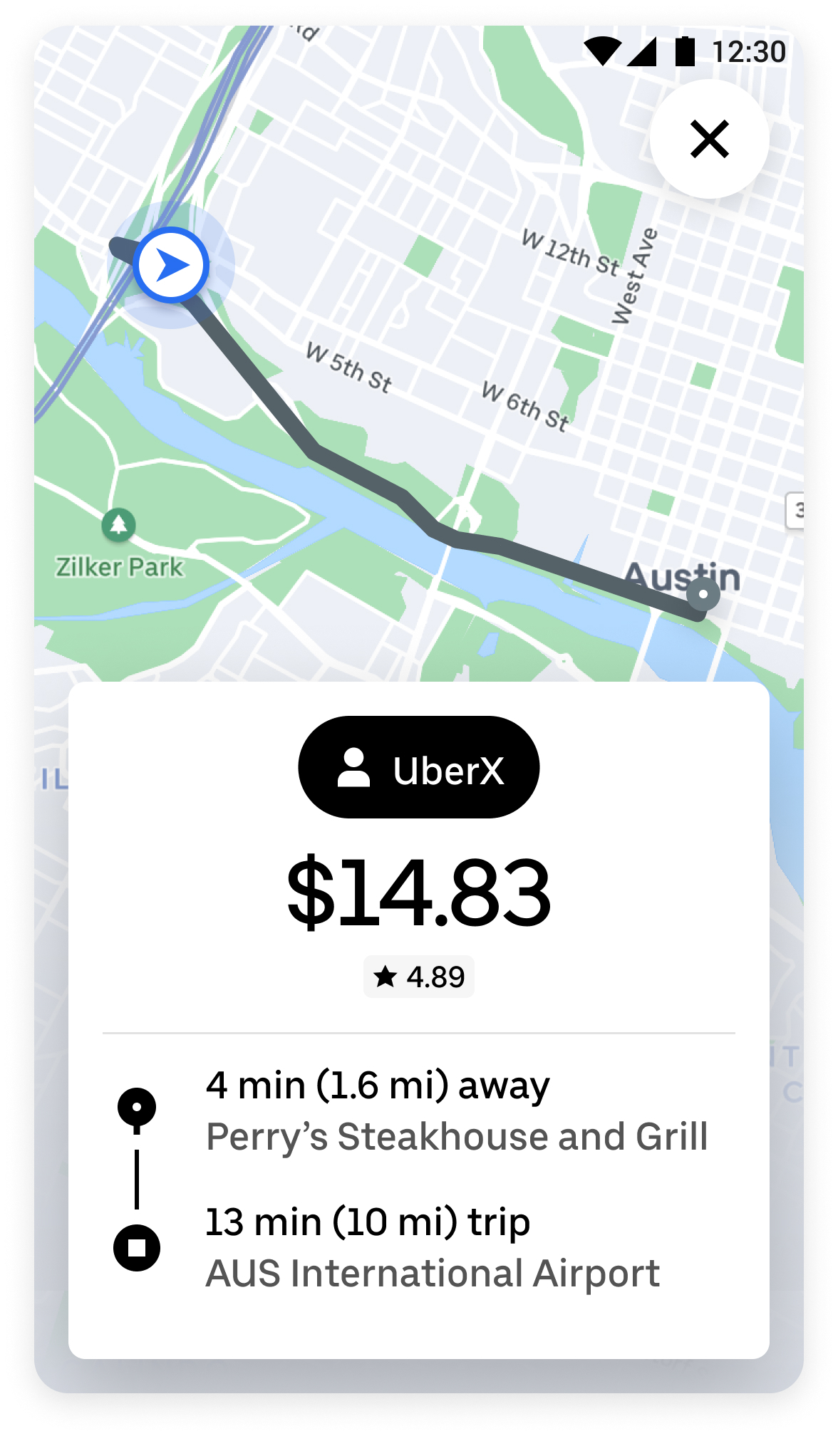
- You’ll start seeing the fare, plus pickup and dropoff locations, right when you receive a request. This means that each time you get a request, it’ll be easier to decide if it’s worth your time and effort.
- Fares will no longer be based on fixed time and distance rates alone. Instead, upfront fares will be based on several factors: some you know well, like base fare and time and distance rates, and some are new, like real-time demand at the destination.
Basically, you’ll know how much you’re getting paid and where you’re going on the accept screen. California had a version of this for a year in 2019 but went back on those changes a year later.
What does upfront pricing look like in action? We had RSG contributor Joe try it out!
What is Upfront Pricing?
Need a reminder on what upfront pricing actually is? As we explained when upfront pricing first rolled out in California, upfront pricing decouples the price drivers are paid from what the passenger pays.
As RSG contributor-at-large Jay Cradeur described it at the time, with upfront pricing, drivers are “able to make their days a bit more profitable and far more predictable.”
Interested in how to calculate upfront pricing? Check out this video by Harry about how it all works: How Does Uber’s Upfront Pricing Work?
Why Is Uber Rolling Out Upfront Pricing for Drivers to New Markets?
The upside of upfront pricing for drivers is that you’ll receive more information at the acceptance screen. More information is something that drivers have been asking for for years. It’s nice to see that Uber is implementing something useful to drivers.
As we’ve even said here on The Rideshare Guy, we generally don’t recommend drivers take short trips because they’re less profitable (unless you’re going for a bonus or quest and need to get a bunch of rides done quickly). That strategy may be changing with this pilot/announcement.
How is upfront pricing affecting drivers? We had contributor Joe P. try out upfront pricing in Minneapolis, and his results might surprise you!
What is Rate Rebalancing?
As part of both of those changes, drivers will no longer see a time and distance rate on their receipt. Instead, an upfront price is what you will get. This will include surge—the surge map is not changing—plus the base fare, and time/distance. But drivers won’t see those numbers.
In the past, out of every 100 rides, if the average was $20/ride, some rides were earning $50-100, and some earned far less. It made things like planning driver earnings occasionally difficult.
With rate rebalance, there will be less variation in the number of rides (in terms of earnings). This makes it so that drivers won’t try to take longer rides, plus shorter rides will also be more profitable.
Basically, rate rebalancing means Uber will be:
- Raising fares on short trips
- Making a little less on long trips
Uber’s assumption is that since most trips are short, it will basically all balance out in the long run. This will be good in cities that offer a lot of short trips, but bad for drivers in suburbs or rural areas since those trips are usually longer versus shorter.
So, if you’re in a larger market where you tend to get more short trips overall, this change will be to your benefit. If you tend to drive in the rural areas or suburbs, you might see your bottom line suffer slightly with these changes.
You can see what this looked like in action, as RSG contributor and YouTube Manager Chris covered this a few months ago:
>
Rate rebalancing will also change what drivers see on their receipt. Why? Probably because they won’t want drivers to figure out what Uber’s take rate is! In addition, if Uber is adjusting rates based on distance, this can be a way for them to change rates without notice as well.
When asked about this skepticism regarding Uber’s take rate, an Uber spokesperson had this to say:
Just like in other markets, drivers in these markets can still see what the rider paid and keep track of what Uber’s take rate.
Uber spokesperson
What Else is Uber Introducing for Drivers?
Trip Radar
Another new feature rolling out is Trip Radar, which shows you what trips are available around you when you don’t have a passenger in your car.
Basically, when you’re driving at slow speeds, you can click Trip Radar, see what UberX rides are available near you, then choose which one you want.
This feature sounds very interesting and I’ll be curious to see how it actually pans out and if drivers enjoy it. Will the requests stay up long enough for drivers to be able to review them before accepting? It sounds like it’ll be a first-come, first-serve situation. Will passengers be left in the cold (so to speak) if no driver chooses their ride from the list of trips available? Or will they eventually be passed along to a driver in the “normal” manner?
These are all questions I have. I imagine it’ll be similar to Instacart batches where you can view them and accept the request, but also have to act fast so other drivers nearby won’t just swoop in and steal a good deal out from under you.
According to Vice President and Head of Mobility for Uber Dennis Cinelli, Trip Radar gives drivers the opportunity to choose worthwhile trips. If drivers are out and want to accept a higher paying request, or a request that takes them somewhere they want to go, they can accept it. These trips will all be fairly close to the drivers as well and are based on driver location.
Is This a Rate Cut for Drivers?
According to Uber, drivers should earn the same but with less volatility—or at least that’s the goal! Uber tried this in smaller markets, but from the sample size they did have, earnings remained consistent.
Drivers do tend to feel like it’s a rate cut since changes are being made that will make short trips more profitable and long trips less profitable, with the average remaining the same, but what proof is there that the averages will be the same? Or at least show that drivers aren’t losing money on every trip?
Uber could show drivers how much they would have made on the old vs new system. Since Uber is making these changes to their system and trying to change driver habits, the least they could do is be upfront with drivers about how the changes will truly affect earnings.
According to Uber, this shouldn’t be a rate cut for drivers, but rather an opportunity for drivers to decide for themselves if they want to accept certain rides. As Cinelli mentioned, if drivers don’t think a request is worth it for them, they can decline it.
Who Benefits From These Changes?
Drivers who like to accept short rides! If you like taking short trips, you’ll probably benefit from this, especially since pay for short rides is increasing.
According to Cinelli in an interview with Harry, in the five pilot markets that rate rebalance already launched in, drivers haven’t seen a change to the earnings.
On the flip side, drivers who prefer longer rides may not benefit from these changes. The earnings you’ll make on those trips will generally decrease. In order to remain profitable, you may need to shift your thinking and strategies based on these changes.
As far as driver incentives, Cinelli did note that drivers in these cities will see a new incentive: for drivers who do 50 trips over the next 3 weeks, they’ll get an extra $100.
In general, these changes will require drivers to become savvier and strategize better. The ‘winners’ here will be drivers who balance short and long trips and don’t only target long trips.
If you do end up liking the changes Uber makes, make note that this is a pilot test and it may be tweaked as it rolls out to other cities. Let Uber know which changes you like (if you’re in one of the pilot cities) and which ones you don’t!
Do Drivers Prefer Short Trips or Long Trips?
We asked our readers on Facebook if they preferred long or short rides and here are some of their responses.
Tim said, “I prefer short rides because long rides I run out of things to talk about and it could become uncomfortable on long rides with nothing to talk about.”
Ezra had an interesting observation: “Short rides are undoubtedly where the money is. Long rides are undoubtedly where drivers think the money is.”
Khandker mentioned that short rides tend to be more profitable for him: “Short rides are like 3 miles for $6. Long rides are disgusting; they’re always like 50 miles for $41. Most of the time you will come back with zero when you take long trips.”
He added at the end that long trips are sometimes ok, but only if there’s a decent surge attached to it.
Chris mentioned that 90% of his rides are from the airport because he prefers long rides. Someone with his thinking, if they’re in a city where this new upfront pricing for drivers launches, might need to shift their perspectives and strategies if long rides end up being less profitable overall.
What do you think about this news from Uber? Do you think this will overall benefit drivers – or is it another drive rate cut?
-Paula @ RSG with additional information from Melissa Berry and Chris Gerace