While it’s not an increase in pay, a streamlined app with input from drivers could go a long way to improving the driver experience. Today, RSG contributor Jay Cradeur shares his perspective on Uber app improvements that would improve the driving experience, making it safer and and easier for drivers. Do you agree with these improvements or have suggestions of your own? Let us know in the comments!
Recently I shared improvements I would like to see in the Lyft app. I focused on Lyft first, primarily because I drive for them and am most familiar with the Lyft app. However, in order to give a balanced perspective, I’ve been driving solely for Uber. This actually has been a pretty good thing, as you can see from the pay summary below.
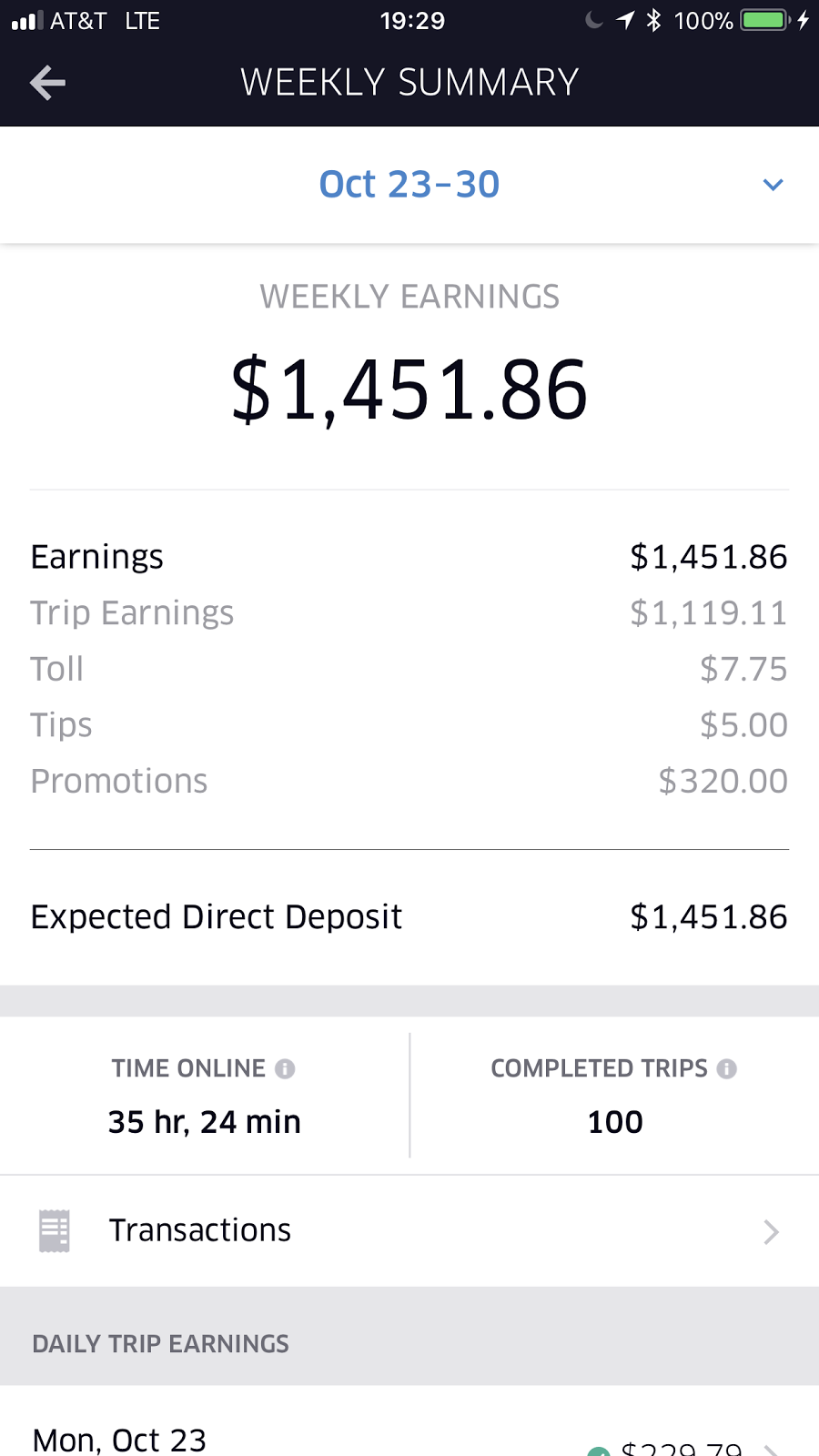
Over the last few weeks, I’ve noticed there are some opportunities for Uber to improve its app, too. Here’s what Uber gets right, and wrong, in its app and how it could improve the app experience for drivers.
What Uber Gets Right
Here is what I like: Uber shows me the surge for each ride, not just at the beginning when I accept the ride, but during the entirety of the ride.
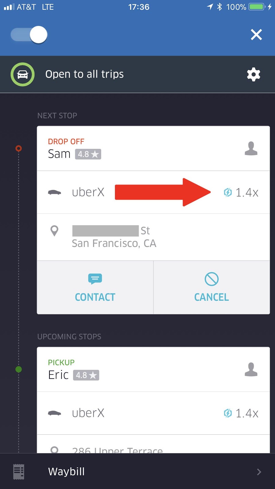
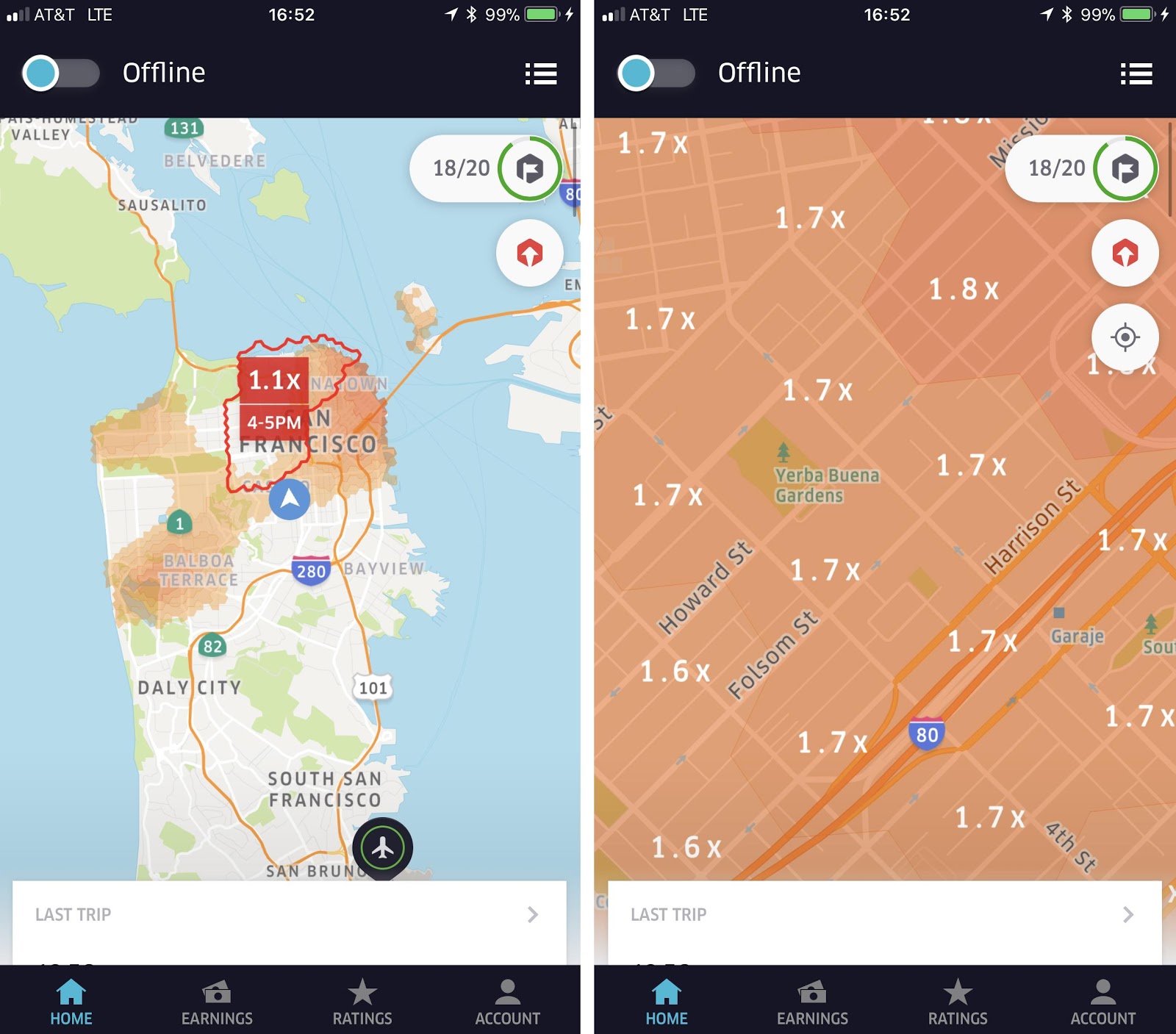
I find this to be very useful information, as I can look during the trip and determine my earnings potential. Uber also provides more specific surge information before I accept a ride. If I am driving around, I can look at the heat map, zoom in and see exactly what the surge is for a specific area. I can use this data to inform my decision as to where I will drive next.
Related: Rydar, the Swiss Army Knife of Driver Tools
I also appreciate that I can easily cancel an individual passenger during an UberPOOL. If I am driving to the airport with 2 people, but they have filled my trunk with luggage, I can easily manage additional ride requests by going to Uber’s secondary page, and clicking Cancel.
This does affect my cancellation rate, but if I can’t fit the luggage in my car, then I really have no choice.
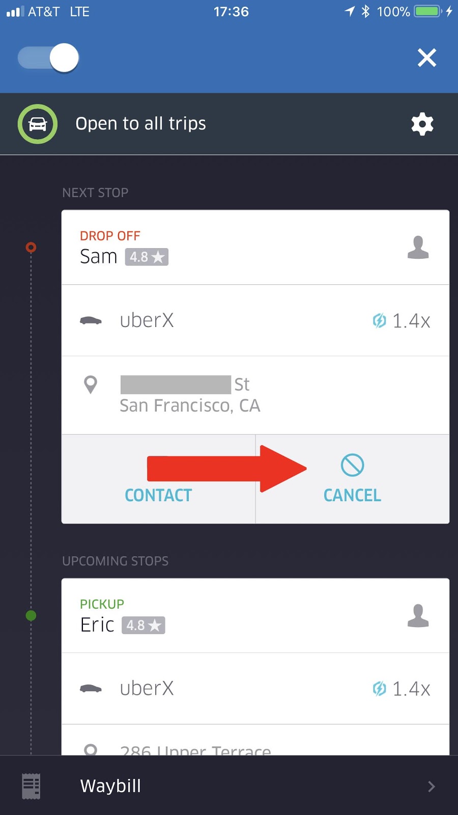
That said, there’s always opportunity for improvement. Here’s a list of Uber app improvements that would benefit the driving experience:
#1 Let Us See Where We Are Going Before We Start The Trip
This is by far my biggest gripe with the Uber app. can only see where I am going once I start the trip. This makes it much more difficult to cancel on rides I don’t want to take.
With the Lyft app, once I notify the passenger that I have arrived, then I can see the trip destination well before the passenger has entered my vehicle. If I don’t like the destination, I can cancel and drive away.
With the Uber app, I either have to start the trip before arriving at the destination, then end the trip and select “Do Not Charge Passenger” or I wait until the passenger has entered my car, check on the destination and then tell the passenger I can not take him or her to their drop off spot. This can be awkward.
Just a few weeks back, I went to pick up a passenger at a hotel in downtown San Francisco at 5:30 PM during rush hour. She got in my car and I started the ride. Her destination was San Rafael, which is well across the Golden Gate Bridge. I told her I could not take her that far as I needed to stay in San Francisco proper. She looked at me and said “Well then why did you come to pick me up?”
This is a totally valid and logical question. I explained to her that I don’t see the destination until I start the ride. She was great about it and got out of the car. Still, it would be much better for the driver and the passenger if we could cancel sooner in the process.
#2 Auto Queue Next Trip Requests
I have no idea why Uber does not make this a standard feature just like Lyft. Lyft automatically adds new passengers to the queue. I always have the choice to cancel if I don’t want the queued up passenger, and it does not even affect my cancellation rate. Uber makes if much more difficult.
And worst of all, if I am talking to my passenger, or focused on traffic, I could miss the ride completely and this affects my revenue. Please don’t make me have to click on the app twice to accept my next ride when I already have a passenger in my car.
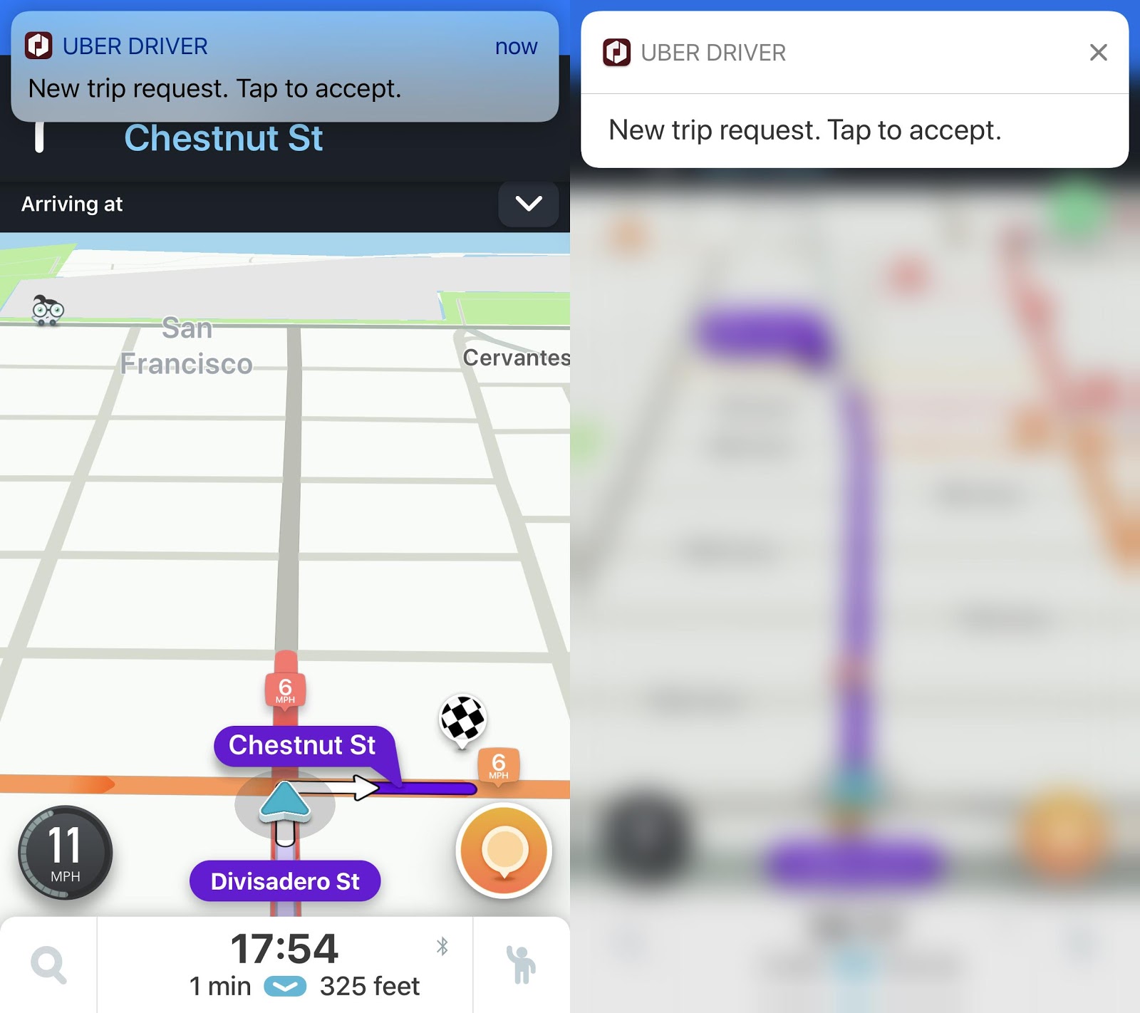
Just the other night, I completed 3 consecutive rides and did not get the $10 bonus. I wrote to Uber support, and they told me I had missed a ride request during the time of the 3 trips.
Of course, I had no idea I had missed a ride request. I expressed to Uber how it can be difficult to talk to passengers, drive, play music, make drop off and pick ups, and also keep an eye and ear out for that little ping sound.
I do not see the rationale for forcing drivers to click “Accept” twice in order to get a new ride. Having auto-queue would allow me to drive in a less stressed environment. I could relax a bit and know that new rides are being lined up for me, rather than worrying about missing a ride and losing out on revenue.
Editor’s Note: Mystro can auto-accept and decline rides for you! For more information and to see Mystro in action, click here.
#3 Show Us The Rider Classification And Surge On The Home Page
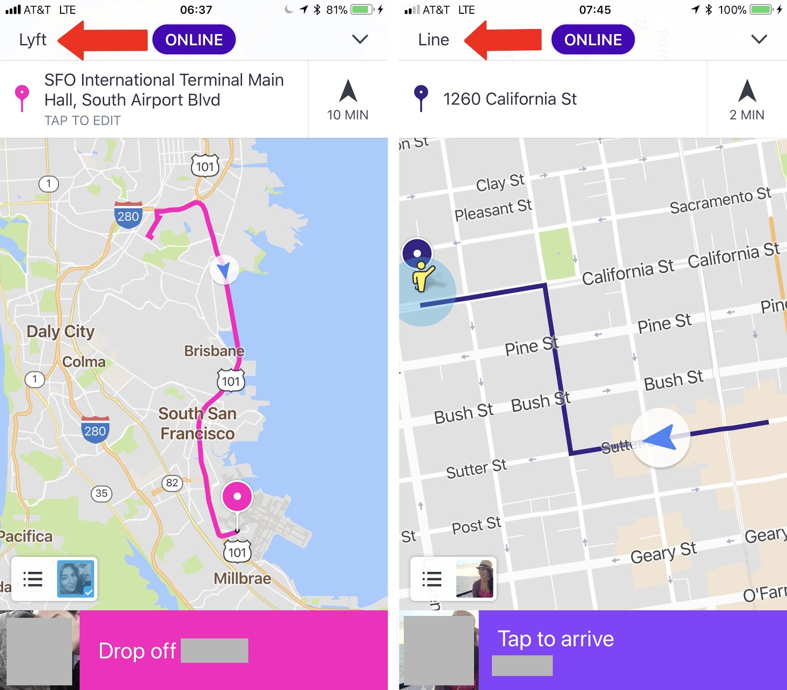
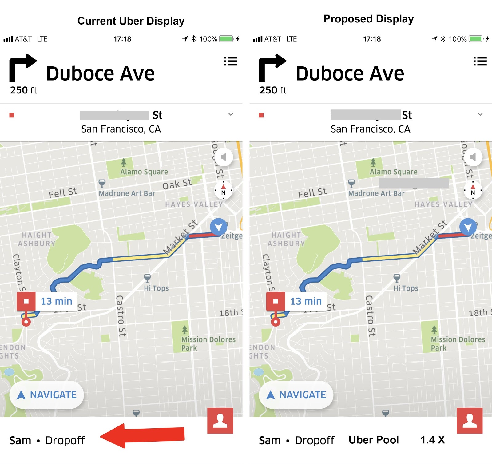
I find it very useful to know my passengers status. If it is an UberX, I know I can drive without interruption, at least until I get close to my destination, at which time I may get a new ping prior to drop off. If it is an UberPOOL, I am ready to get a new ping and pick up additional passengers. This is how Lyft shows the rider classification on their Home Page.
Here is how Uber could improve their home page by adding the Ride Type and Surge on their home page.
These app improvements are three ways I think Uber could improve the driver experience. Uber has a wonderful app, and this is my dream wish list for improvements to make the driver experience better and more efficient. By incorporating these features, I can be a better driver, and the passengers will have a better experience.
Do you agree or disagree? Can you think of anything else that Uber could do to improve the app?
-Jay @ RSG
