Harry here. Have you ever looked at your Uber pay statement and been completely confused? You’re not the only one! We’ve received a lot of emails about Uber’s pay statement and how to determine how much you’re actually getting paid, so today we’re having RSG contributor Will Preston explain the Uber pay statement. Have questions about your pay statement? Send me an email or leave a comment below!
If you find yourself confused by your new earnings statement, don’t fret. You’re not alone. I’ll explain how it works and how it actually gives you more information than we’ve ever seen before.
Not a Rate Cut
We’ve gotten a bunch of emails wondering about an unannounced “rate cut” but this is not a rate cut. Uber is just displaying the per mile and per minute rates after their cut (right image below) instead of before (left image below). Uber is no longer taking a strict 20 or 25% cut of the fare, so they’ve changed the way they display your earnings.
Here’s how it looked back in March (on the left) and here’s how it looks today (July):

As we’ve covered, the customer is now being given an “upfront fare” based on a number of factors that include time and distance and – surprisingly enough – what Uber thinks they can get away charging that customer. Uber is experimenting with increasing (or decreasing) customer prices on certain trips, but without giving you a cut of the action. For better or worse, you will always get paid the per mile and per minute rates listed in the rates section of your local Uber site.
The Good News
The really good news though is that Uber is now showing us – for the first time – what the customer is actually paying. This means that if some people’s fears are realized and Uber is just doing this to consistently start taking more than 20-25%, then at least we’ll know about it.
My only criticism is that the customer’s payment amount is a little deeper than I would like. I applaud Uber for showing us what the customer pays, but I would like to see it in the same list with what I get paid. Right now the main list shows clock time, trip time, trip distance, and my share of the fare. Here’s an example of what that looks like.

They could easily add two columns to that and show what the rider paid and whether or not there were any rider fees (e.g. airport fees, tolls, split fare fees). This would make doing this analysis much easier, as you can cut and paste the entire page into a spreadsheet no problem. Here’s what my dream earning sheet would look like. Maybe Uber will incorporate this in their next app update? I can dream!
Viewing Your City’s Rates
Login to partners.uber.com and click the symbol in the upper-left-hand corner to pull down the main menu.
Then select Fares.

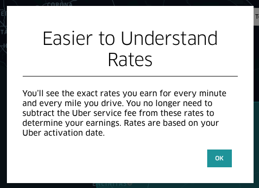
You may be presented with a box that will say just what I’m saying, that Uber is now showing you what you get paid and nothing more.
Along the top, you will see dropdown lists where you can select the different cities you’re allowed to drive in, the different cars you have, and which service you’d like to see rates for (e.g. UberX, Pool).

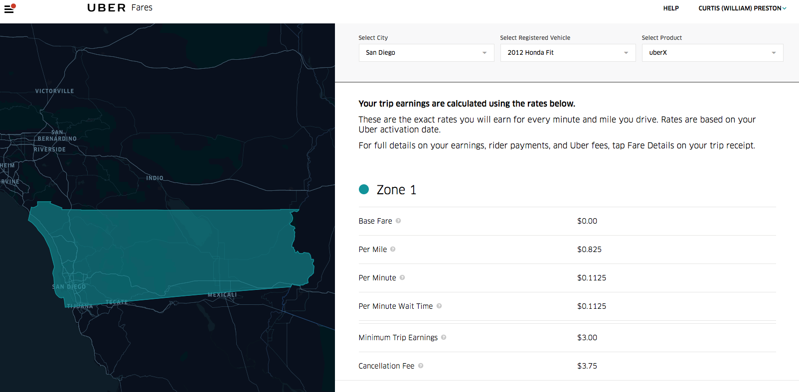 You’ll then see a map on the left showing one or more zones and a description of each zone’s fares on the right. Note that it now shows wait time, and that you get paid for that.
If you take the numbers displayed there and divide them by .75 or .80 (based on if you are on a 25% or 20% commission rate), you should see the rate that you’re familiar with.
For example, you can see that Uber says my UberX per-mile rate is now .825 in San Diego. I’m on a 25% commission rate, so I divide .825 by .75. That gives me $1.10 per mile, which is the rate I was familiar with in San Diego.
Your Pay Statement
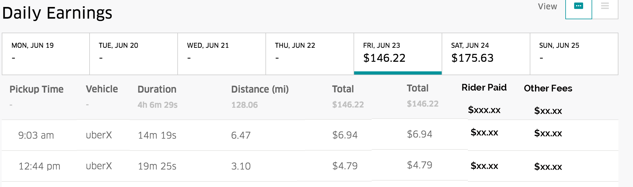
If you go back to the main menu and select Partner Earnings, you should see a page that looks like this one. You might need to select the appropriate week in the upper right-hand corner. This displays a summary of how much you’ve earned this week, how many trips you’ve done, your online hours, acceptance rate, and any driver cancellations you’ve done. It then lists a summary of all your rides under a series of tabs, each displaying one day’s worth of rides.
Select a particular day tab to be shown a summary of your rides for that day. The summary includes the time of the ride, what type of ride it was, how long the ride took, how many miles you drove, and what you got paid for that ride. If you’ve been looking at your pay statements for a while, this page is probably pretty familiar. The truly interesting stuff is what happens when you click on one of the rides.
It will open a page that looks like this.
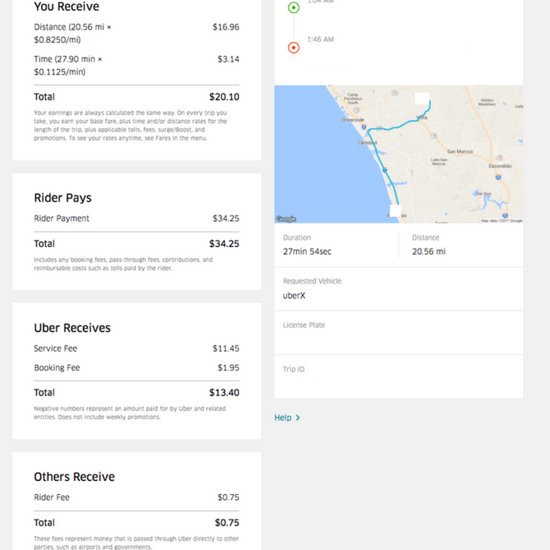
The page starts with the “You Receive” section that will list anything you were paid for that ride, including mileage, driving time, waiting time, and any cancellation fees. This number will match the number in the summary column from the previous page.
To the right of that, you will see the beginning and ending addresses along with a map of the route that you took. Like before, this is a display of the route you actually drove, not a suggested route or anything like that. So if you got lost or took an odd route, you would see it on this map.
Here’s the interesting part. Uber is now showing us what the rider paid, including booking fees and other fees. In this case, for example, the rider was charged a $.75 fee to split their fare with another passenger. For the first time, this allows us to calculate the percentage that Uber is actually taking from each ride. Let’s do that for this ride, shall we?
The passenger paid $34.25, from which we should subtract the $.75 fee, as that is technically a separate transaction. That leaves us with $33.50. If I divide $13.40 (Uber’s total take) by $33.50, we see that Uber’s take on this ride was 40%.
I’m curious, though, of the percentage that they are taking after taking out the Booking Fee. While I completely agree with you that the booking fee is bogus, and we should get 75% or 80% of the whole thing, it’s been that way for a while.
Subtracting the booking fee from the $33.50 leaves us $31.55. Dividing $11.45 by $31.55 gives us 36%. This means Uber earned 36% on this trip.
Is this one of Uber’s ‘experiments’?
Is this the case where they charged the passenger for the longest route, but I took a shorter route? Or did they charge this passenger even more than they would have paid for a long route? Let’s take a look. If I put these addresses into Google Maps and say that I’m leaving at 1:30 AM, it gives me three possible routes and times. Let’s calculate what their fare would have been for those three routes.
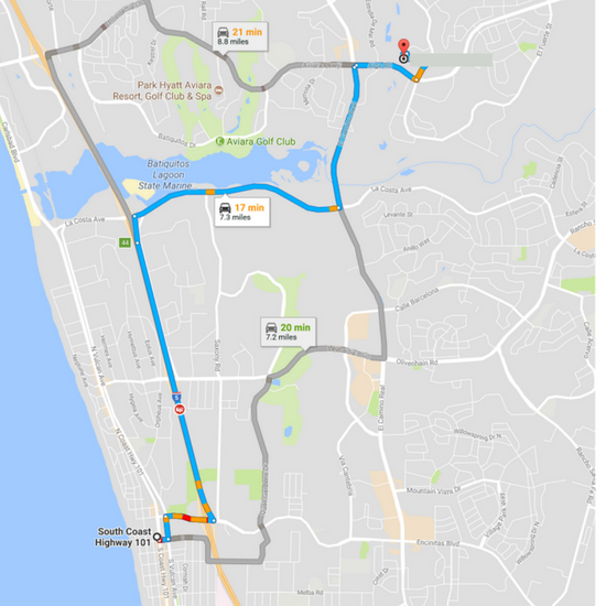
One route is 19.7 miles and 30 minutes (shorter than the route I took), which would have cost them $26.16 (plus the booking fee) based on San Diego’s rates (19.7 * 1.1 + 30 * .15).
Another route is 23.2 miles and would also take 30 minutes. The fare for that would be $30.02 (23.2 * 1.1 + 30 * .15). So, yes, this ride is an example of what we were told would happen.
Uber charged this customer 10% more than the highest possible fare they should have paid just to see if they’d accept it. They did. And I didn’t get a piece of that action. I agree that stinks.
How often this is happening? On some of my rides I know Uber actually pays me more than what the customer paid, so they lose money. Will these two balance out? We’ll take a look at that in my next blog post and the answer may surprise you. But for now, at least you know how to read your pay statement.
Readers, do you have more questions about reading your pay statement or have additional questions about how Uber pays out its drivers (or what it charges passengers)? Leave your questions and comments below!
-Will Preston @ RSG